


Charts in QlikView are very effective .
They provide a way to visually represent the data
QlikView provides a good collection of Charts.

Charts in QlikView require to have a dimension and an aggregated measure in expression.
If you want to learn about dimensions and facts, please visit Dimension and Facts
Note – Though most charts require a dimension and an expression, some charts do not require dimension like Guage chart
In this article, i want to talk about Trend/Line Charts in QlikView.
Trend/Line chart is used to show trend in data over time
I will load few rows of data from an excel sheet. If you are new and want to learn how to load data from excel , please visit Load data from excel in QlikView

By using Date as Dimension and Sum(Expenses) as Expression resulting chart will look like :

Notice in above chart, even though there are different categories in data, chart displayed just one line. That is because dimension is Date. Chart expression is being aggregated on Expenses and is sliced or grouped by Date.
To get 3 trend lines, each for one Category, add Category dimension in addition to Date. You will get the following chart

In this chart , notice that second dimension Category is represented in colors. The chart represent the expenses of each category in different time periods.
Note – Line chart allows maximum of 2 dimension. Addition of 3rd dimension will have no affect.
To Show 2 measures in the line chart
What if one wants to track say 2 measures Expenses and Allowed Expenses over time. How to display more than one expression in the trend.
I have added a second measure Allowed Expenses to my data set. I have added some random values to it.
To Show that in my chart,
– remove the Category dimension and
– add second expression Sum(AllowedExpenses) to my chart.
My resulting chart will look like the following,

Note – I have used value on data point property to show the numbers and used ctrl+shift to move legends to the top
If you have multiple trend lines then it will be difficult to display the legends. Also users will have hard time to match color with the line.
There is another way to displaying the legends. It will display legends at the end of each line.
Stephen Redmond has explained it very clearly in his blog .
The resulting chart with renewed legends will look like the following :
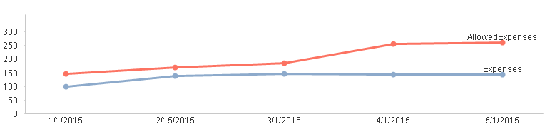
Steps to create a Trend Chart with Legends at the end of the line:
1. Uncheck “Expressions as Legend” in the expression tab. This will remove legends from the top
2. Use dual function to show the expression at the end of the line
Dual(if(Date = Max(Total Date),’Expenses’,’ ‘),Sum(Expenses))
3. Values on data points should be check on the expression tab
4.Number format property under Number tab should be set to “Expression Default”
Trend charts can be a very useful visualization. Explore having 2 axis on a trend chart.
Further Readings: Lose the Legend in Line Charts


 :
:
The article is really helpful for developing a basic and step-by-step understanding on graphical (line chart) representation of statistical data of business trends using Qlik View.