


Scatter chart is very useful in displaying the relationship between 2 numeric values over a dimension.
Such relationship, for example, can be between Product Sales Amount vs Quantity or Profit vs Quantity and so on.
In this article, we will explore how to create Scatter chart in QlikView.
Loading data in QlikView
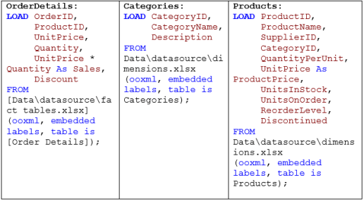
For this example, i will load the following tables in QlikView. You can create these tables with some sample data.
- If you need these tables with data, let me know and i can post tables with data.
if you are new to QlikView learn how to load excel files in QlikView
Creating Scatter chart in QlikView
- Before creating a scatter chart, you should know what relationship/s you want to analyze. For this example i want to analyze – Sales vs Quantity in each Category.
- On a blank sheet, right click – New Sheet object / Chart and select Scatter chart from the list of charts.
- From the Dimensions tab, select CategoryName.
- On the next screen, pick the two numeric values or expressions. Since Scatter chart will be displayed as a bubble, specify the size of the bubble. Size of the bubble can represent anything. I want to use Quantity as the size of the Bubble so that it will be clear visually which Category sold the most.

5. You will get a chart, like the one below

6. To increase the size of the bubble, right click on the chart and go to properties. Navigate to the Presentation tab. Uncheck Autosize Symbols and increase Max Bubble Size to 12 pt

Also change the Style and Color of the chart so that chart is more clear.


 :
:
Please guide on qlikview project experince
Please let me know what kind of help or guidance you need.