What is a Pie-chart
Pie charts are used to represent the proportion or ratio of categories against the whole. For example, if total Sale of a company is 100k and user want to know what percentage of each category (of products) contributed to this sale then you can use a pie-chart.
*Checkout pie challenge at the bottom of this article and win
Is Pie-chart useful
There is lot of debate on the usability of a pie-chart. This is due to the fact that if number of categories or segments in your data is huge then it will be difficult to get any useful information from the pie-chart.
Even though there are draw backs, Pie-chart is still useful in the business world.
How to Create a Pie-chart
Data Load/Script
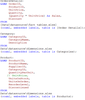
- I will load the tables Category,Product and OrderDetails. I am using these tables from Northwind database. This database is available for free online. Let me know in case you need the data. I have these tables in excel format. To learn about loading excel files in QlikView, visit connecting to excel file
- I have also created a calcualted field in OrderDetails table. This field will calculate the Sales (Quantity * UnitPrice) As Sales
- Once these tables are loaded, i get a synthetic key between OrderDetails and Product table as multiple fields are common between these tables. To resolve synthetic key, i commented UnitPrice in the Product table and executed the script. To learn more about synthetic keys, visit resolving Synthetic key
- My script looks like the one below
Creating Pie Chart
- Once the data is loaded, right click on the white space on the sheet and select New Sheet Object > chart. From the general tab, select Pie-chart.
- Under the Dimensions tab, select CategoryName as Used Dimensions.
3. Under the Expressions tab, write the expression as Sum(Sales). Make sure to check Relative check box. Relative option will display numbers as percentages.
4. Under the presentation tab, check the option for Show Legend
5. Pie chart is created. Explore different option on the Expression and other tabs to see other available options.
6. Since each color of of pie represent a percentage, would it be better to show the percentages with the legends to make it more readable. Right click on the chart and to the Presentation tab. Under Presentation, check the option for “Show Numbers in Legend”. You will get a chart like the following – with percentages for each category displayed.
Pie Challenge
*First participant to post the correct solutions to the below 2 questions – will receive either the value or the kindle version of the book QlikView Questions And Answers .
You can post your solutions by providing detailed steps in the comments section or by sending your qvw or screen shots at info@learnallbi.com.
- Pie represents the “Percentage of the Total”, it will make the chart more useful, if in the above chart we can display the Total sales. Can you take up this challenge and post the steps to display the Total Sales in the above chart. It will look like the screen shot below.
2. Can you make pie chart more elegant and user-friendly. Provide steps to make the chart look like the one below


Hello sir,
I have the solution and rather than typing more I want to share the qvw. But I’m not getting how to share the app. Please guide me so that I can share soon.
Regards,
Joy
Joy:
You can email your qvw at info@learnallbi.com
Joydip:
Thanks for emailing us your solution.
Congrats !!!
Your solution looks very good.
Also checked your data modelling script. You have done a great job.
Please check your email.
You will soon receive a gift card from Amazon to buy the kindle version of the book – QlikView Questions And Answers.
Dear Chandraish,
I’m feeling good that I won the competition and get awarded by the Amazon gift card. But the matter is I’m still unable to buy the book by using the amazon gift card. Whenever I’m trying to buy using dollar its saying that I have to buy the book from my country domain website i.e. Amazon.in and at amazon.in I didn’t find any gift bonus. I’m not getting how to get the book. Please help me in this regard. I’m really excited about the book as I like your blog posts very much and a regular visitor as well. Thanks in advance.
Regards,
Joy
Joy:
I checked with the other candidates,who purchased this book in India. They can login to either Amazon.com or Amazon.in to make the purchase.
Can you please try once again, logging into your Amazon.com account and see if you can make the purchase.
Please do let me know the result.
How to do this can some one send me the steps to do that.
Kumar:
I will wait for few days for our other readers to respond to your question.
If there is no response then i will give the steps by Monday.
Solution to Ques 1.
1. Follow the steps as mentioned in the blog to create a pie chart.
2. Right click on the pie chart and go to properties.
3. Navigate to the “Presentation” tab, go to the edit box of “Text in Chart” and type the following expression in the
“Text” edit box. Remember to put “=” before the expression
=’Total Sales:’ & Chr(10) & Num(Sum(Sales),’$#,###,###.##’)
Chr(10) is used for “Line Feed” so that Numeric value is displayed under the Text “Total Sales”
Num function is used to format the Numeric value as #,##,###.## .
4.After you complete the above steps, click on the chart and press “ctrl + shift” on your keyboard. This will display red boxes on the chart
and it will help you move the text or the chart around. You can move Total Sales: 1,354,458.59 to the desired location.