


Gauge charts in QlikView are very useful to display when your measure lies within a threshold and outside a threshold value.
There are times when executives want to see visually their key measures and want to know at a glance whether values are falling within a acceptable value(green) or outside acceptable value (red).
I will show you how to create a simple gauge chart.
I will use Orders and Customer table to see that whether freight values for a Customer lie between the acceptable value or outside the acceptable value.
Steps:
1. Load Orders and Customer table


2. Create a sheet object and select chart type as Gauge

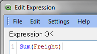
3. Add expression for Freight
4. Select Gauge Style
 Set Gauge properties. This is the most important part of creating this chart.
Use Min and Max to set the dial size. Take max size based on the measure you are using. For my example i took 200, assuming that my Freight value will be maximum 200. Here you will also set segments and colors for your acceptable and not acceptable values.
So i set Segment1 and set lower bound as 0 and color as green. Lower Bound means the level or number from where the green color will start. All of these values(based on your requirements) can also be calculations.Use Show scale to show scale on the chart.
To set lower bound, make sure that “Auto width segment” is unchecked.

Similarly set Segment 2 and set its color to Red and lower bound to 90. Lower bound is just saying that red color will start from 90 to max. So in this chart i am saying that my maximum freight is 200 , out of which green is 0 to 90 and red is 90 to max i.e. 200.

5. click finish and check your Gauge chart. Create a list box for Customer to see see freight for each customer if it lies within Green or red segments. Here customer objective should be to see that for the products he ordered whther his feight is higher or lower.


 :
:
Is there a way to place the gauge labels within the boundaries of the unit lines in order to make it look more like a real spedometer?
Thanks for the help!
Walter:
In the chart properties, under presentation, you can add your text under “Text in charts”.
Then using ctrl+shift you can move this text to any location in the chart.
It is very good explanation