


Combo Chart in QlikView
Combo chart in QlikView is a combination of a bar and line in a single chart.It can display one expression as a bar and other expression as line or symbol. A combo chart can have maximum of 3 dimensions.
In this article, i want to show how to create a combo chart and a technique to display value on data points only for the maximum values.
For this example i will load the following data :

Steps to create Combo Chart in QlikView
1. Right click on the sheet and select New Sheet Object / Chart
2. Select chart type as combo chart (third chart from the left -one with bars and lines)
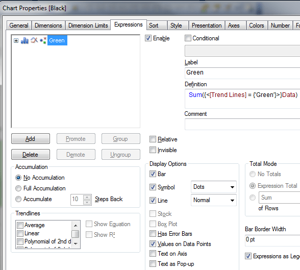
3. Select Month as Dimension and create expression like
Sum({<[Trend Lines] = {‘Green’}>}Data)
4. Set the display options as Bar,Symbol and Line. Check the property for Values on Data points too. Set the sort as Y-Value Descending
5. Your expression and property setting will look like the following :
After the above settings, the resulting combo chart will look like the following

As you will notice, every data point is showing a value. Sometimes requirement dictates that you should show the value only for the maximum value, for example in this case 75. This is particularly useful when you have multiple lines.
Steps to display only the maximum value data point in QlikView
1.Create a variable to calculate the maximum value. You can create this variable in Context menu/Variable Overview or in script
Learn how to create variables in QlikView
vGreenMax=Max({<[Trend Lines] = {‘Green’}>}Data)
2. Go to the properties of the combo chart and create a new expression, like the following
if(Sum({<[Trend Lines] = {‘Green’}>}Data) = vGreenMax,Sum({<[Trend Lines] = {‘Green’}>}Data),”)
Set the Display option as Symbols – Dots and check Values on Data points
3. Go to your previous expression and un-check Values on Data Points
4. Your resulting chart will look like the following , with only Max value displayed on the data points

Combo chart is a very useful visualization object in QlikView.


 :
: